Module One of GIS 6005 - Communicating GIS revolved around cartographic design principles and typographical principles that should be followed to create effective maps. The five design principles studied were as follows:
- Visual Contrast
- Legibility
- Figure-ground organization
- Hierarchical organization
- Balance
These principles were practiced in all five parts of the lab while typographical design, or labelling, was introduced into the last three sections of the assignment.
For part one, datasets of the Austin, Texas metropolitan area were provided and were to be compiled into a cartographic reference map for tourists coming to the city. A simple layout was provided with all required map elements, but the final map [shown below] does not incorporate any of the original layout's elements. Here is a brief synopsis of the five design principles and how they were applied to the final map:
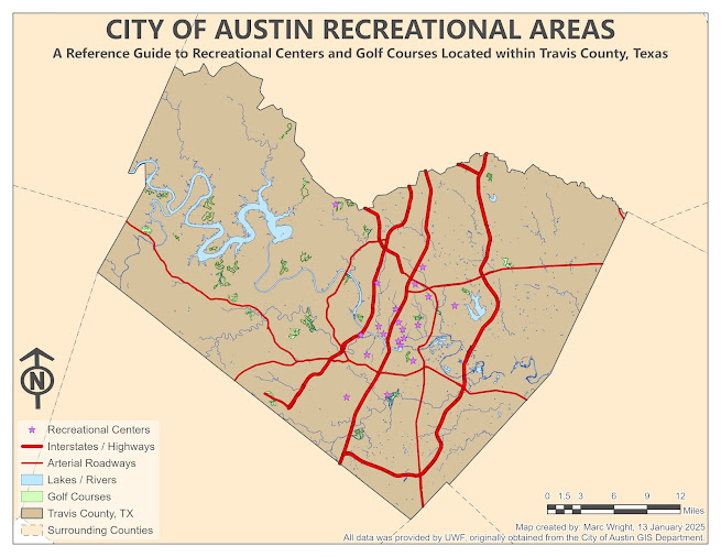
Visual contrast 'relates to how map features differ from each other and their background' [Kimberling, 2012, p.133]. This was achieved by using bright colors for the symbology of the feature classes that are emphasized against the earthy tones of the background. Legibility is 'the degree to which something can be read and deciphered' [Kimberling, 2012, p. 132]. Careful consideration was given to the font types, size, and font colors throughout the map, ensuring they can be read at a reasonable distance. Figure-ground organization is 'a perceptual phenomenon in which our mind and eye work together to spontaneously organize what we are viewing into two contrasting impressions - the figure, on which our eye settles, and the amorphous ground below or behind it' [Kimberling, 2012, p. 136]. To achieve this aesthetical organization, a darker color was used for the focal point of the map to visually bring it to the forefront of the page. Visual hierarchy is 'the graphic structuring of the features that make up a map' [Kimberling, 2012, p. 137]. This hierarchy is simply achieved by ensuring the focal point of the map [Travis County] has the most visual weight, the title / subtitle are second to the map, and the remaining map elements hold the least amount of visual weight, not stealing unnecessary attention from the user's eyes. Finally, balance 'involves the harmonious organization of the mapped area and any marginalia on the [map]...' [Kimberling, 2012, pg. 140]. This design principle offers much more flexibility than the others, is more subjective in nature, and is achievable through many differing methods. For this map, it has a more symmetrical, or formal, balance with the map dead center and the marginalia organized on both sides at the bottom of the map. This balance is highly contrasting with the balance achieved in part two of the lab [see next map below].
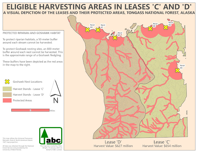
Part two of this lab was creating a map for a lumber company that illustrates how much land can be harvested in two land leases, both located in the state of Alaska; all five design principles introduced in part one were to be addressed and applied in this map as well [see below], but the final product is quite different between the two maps.
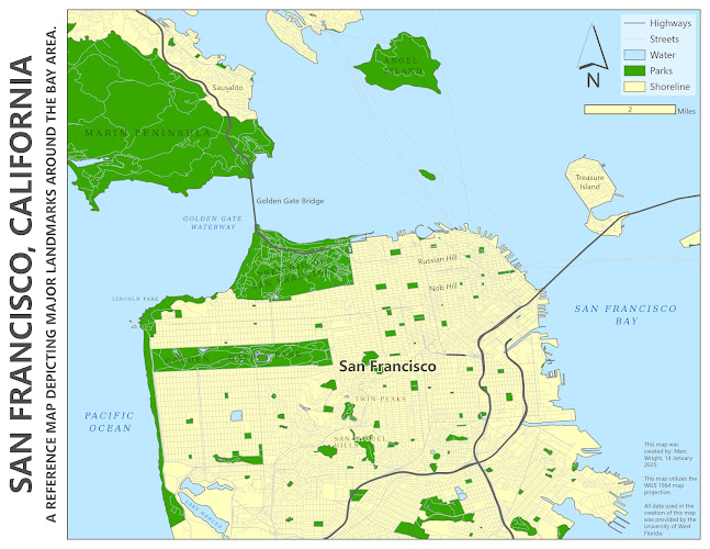
Part three of this assignment still focused on the five cartographic design principles, but introduced labelling practices into the design process. There are typographical standards that provide the cartographer with general guidelines, but sacrifices sometimes need to be made to achieve the desired result. A map of San Francisco, California and some of its major landmarks was the required deliverable. Here are a couple design principles that were followed in the creation of this map: first, since the map is of San Francisco, this text was given the most weight by using a bold, larger font than the rest of the labels. A sans serif font was used in the labelling of all cities and neighborhoods because that is a cartographic standard; manmade landmarks are labelled with a sans serif font. The parks were labelled with a serif font in a green hue that is contrasting to the shade of green used in the parks themselves. Also, the spacing was increased between the letters of these labels because it spreads the labels out over a larger area, visually conveying that areal features are being labelled. Lastly, a serif font was also used for natural features in a brown hue that is contrasting to the shade of brown that was used for the land mass. Since there are roadways all over the map, they were displayed in a light shade of grey, and a halo was used on most labels that overlaid the streets to increase legibility. These decisions led to a map that is visually balanced, aesthetically pleasing, and hierarchically organized to emphasize which landmarks are most important on the map.
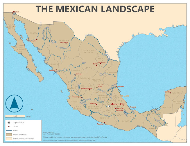
Finally, for part four and five, the deliverable was a map of Mexico and its significant landmarks. The same principles that were applied in step three were relevant to step four and five also, but more considerations had to be taken because the amount of labelling on this map was somewhat daunting. In step four, the only labelling that was required was the rivers. This provided an opportunity to explore the various settings to achieve a desirable result. As shown in the map below, a blue, italicized, and serif font was used for the text elements, but they were manipulated in a way that they curve along the linework of the feature class. Once these labels were added to the map and properly formatted, cities, states, and the capitol city were added to the map. Once all the labels were on the map, it was apparent that design choices, and sacrifices, were going to be required to create a legible end product. The first decision was to reduce the number of cities that were included on the map; to accomplish this, all cities that had a population less than 250,000 people were eliminated. This greatly enhanced the legibility, but it was still highly congested around the capitol city. Due to the small size of the District of Mexico, and it being a federal district [not a state], it was eliminated from the map as well. These design choices led to a final product [see below] that was substantially more legible than one displaying the label for every feature class.
Sources:
Kimerling, A. J. (2012). Map Use:
reading, analysis, interpretation (7th ed). Esri Press Academic.


