Showing posts with label GIS 5027-Remote Sensing. Show all posts

Tuesday, December 5, 2023

GIS 5027 Final Project - Mapping Eastern Redcedar Encroachment in Western Oklahoma...

My research project for Remote Sensing and Photo Interpretation was modeled after a case study named "Mapping the Dynamics of Eastern Redcedar Encroachment into Grasslands During 1984-2010 Through PALSAR and Time Series Landsat Images" which argues that the invasion of the Eastern Redcedar throughout Oklahoma can be map / analyzed using remote sensing technology. While the scope of this case study was well beyond the scope of this introductory course, I modeled my paper after this research project and attempted to create encroachment maps using introductory fundamentals of remote sensing that were presented throughout this course. The entire paper can be read below [the picture layout cannot be viewed correctly from a mobile device].

Sunday, November 19, 2023

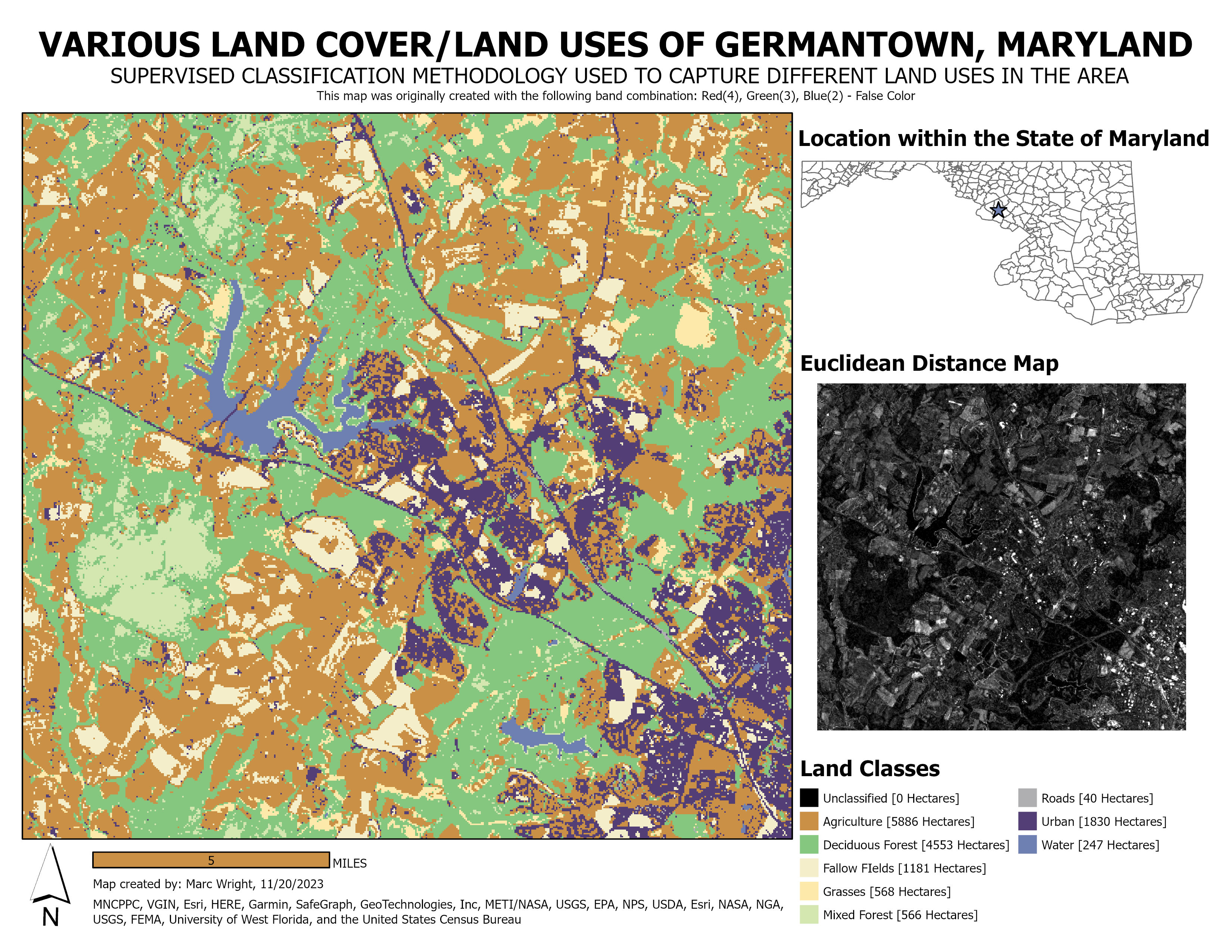
GIS 5027 Module 5 - Unsupervised and Supervised Classification Methods


This week's lab assignment focused on Unsupervised vs. Supervised Classification methods. The first part of the lab explained how to perform an Unsupervised Land Use / Land Cover Classification on an aerial image of the University of West Florida campus. The second part of the lab walk us through the Supervised Classification method. This method is much more extensive and methodic, creating a more accurate classification map. As displayed above, our final deliverable for this project was a land cover / land use map of Germantown, Maryland. While I am happy with the quality of this map, I would like to know for sure what accuracy level the classifications achieved; not knowing this information concerns me to an extent. Also, if I had to redo this project, I would definitely change the initial band combinations of the original satellite image. For the map above, I went with a false color Red(4), Green(3), Blue(2) band combination. Other than these minor issues, this laboratory assignment was extremely informative and a nice set-up to dive into the final project...

Monday, November 13, 2023

GIS 5027 Module 4 - Spatial Enhancement, Multispectral Data, and Band Indices

 Module 4's Lab Assignment was focused on downloading satellite imagery [through the United States Geological Survey] and making adjustments to these multispectral images to make areas of concern more visible to the human eye. This was first accomplished through the use of low-pass filters, high-pass filters, and sharpening filters. After exploring these options in ERDAS Imagine, we applied various filters to images in ArcGIS Pro. This exercise was brief in nature, so exploring the differences between the filters included in both programs will be necessary to differentiate between the strengths, weaknesses, and outcomes of each. The next portion of the lab was targeted at investigating brightness levels on the different bands of the satellite imagery by investigating each layers histogram; this can be done in both programs [Imagine and ArcGIS], but I chose to focus on Imagine and import the subset images into ArcGIS to format the map layout. For this exercise, we were tasked with identifying three features based on spikes in pixel values on specific layers of the multispectral image.


The first feature we were asked to identify was one that had a spike in pixels with very low brightness values; given the fact that water absorbs a lot of electromagnetic radiation, this one was relatively easy to discover. As seen in the map above, I chose a band combination that gave the water a very dark [almost black] tone that greatly contrasted from the bright green / orangish tones of the land surrounding it. 


The second feature we were asked to identify reflected almost all of the visible light, but absorbed electromagnetic energy in the thermal spectrum. This indicated the presence of ice / snow. In the map above, I chose a band combination that gave the snow / ice a bright pink tone and the land surrounding it a contrasting brownish orange tone. The green areas would be parts of the ice / snow that are melting, or areas that are reflecting energy that is closer to the near-infrared spectrum.


Finally, we were asked to find a band combination that would exaggerate the areas of the water that were reflecting higher levels of visible light [possibly caused by the presence of sediment in the water that would be reflecting the electromagnetic radiation, or possibly areas of water that are more shallow than the darker areas]. As displayed above, I chose a band combination that gave the water and land a moderate contrast, but the yellow areas within the water provide the high contrast needed to investigate the areas in question. 

Overall, this lab was very intensive and full of information, but was a good opportunity to really begin investigating the spectral signatures of various features / materials and also a great opportunity to learn the capabilities of ArcGIS and ERDAS Imagine as well.

Monday, November 6, 2023

GIS 5027 Module 3 - Introduction to ERDAS Imagine


 Module 3's Lab Assignment was to familiarize ourselves with a new software program named ERDAS Imagine. While there are a daunting number of options and buttons, I feel like this was a proper introduction to a complex program. The map above is a subset of a larger raster image of a portion of Olympic State Park [located in western Washington state] that displays each pixel as one of seven different categories defined by the reflectance obtained by AHVRR satellite imagery. The objective of this assignment was to compare the areas of the entire raster image with the areas of the subset image that was created from the original. As displayed in the legend, there are [7] different classifications and the area of each [in hectares] is displayed next to the category name. Comparatively speaking, the areas of the classifications listed in this subset are minute compared to the areas listed in the original raster image. Finally, the subset image was imported into ArcGIS and a map was created to aesthetically display the information obtained throughout this assignment. 

Monday, October 30, 2023

GIS 5027 Module 2 - Land Use / Land Classification


This week's lab exercise consisted of analyzing an image of Pascagoula, Mississippi according to its land use / land classification. After the initial analysis, feature classes were created for each type of land classification [USGS Land Classifications, Levels I and II] and polygons were overlaid throughout the entirety of the aerial photograph according to the determined classifications. Once the entire map had been categorized, Google Maps Street View was used as a replacement for "in situ" ground truthing, and each sample point was visited using Google Earth. The accuracy for each of these sample points was determined as either correct or incorrect. As the map states above, the overall accuracy of my map was 70%. However, a certain percentage of my inaccurate classifications were due to the sample points falling in areas outside the confines of my minimum mapped unit, so I am pleased with this percentage rate. Overall, this exercise took a great deal of time and a great deal of decision making but was a good opportunity to learn the LU/LC process. I was content with the accuracy percentage, and I am happy with the aesthetic quality of the map itself. More information on the USGS Land classification system can be found in PDF form at the address listed below:

Monday, October 23, 2023

GIS 5027 Module 1 - Visual Interpretation


This week's lab assignment was the first of our Photo Interpretation and Remote Sensing class. This module focused on visual interpretation of aerial photographs that were provided by UWF [originally obtained from the United States Geological Survey]. The map above analyses an image according to various tones and textures, with a created feature class to distinguish the 5 classes of each.  The map below contains an image that identified objects according to [1] size/shape, [2] shadows, [3] patterns, and [4] associations of nearby objects. The images were then placed on layouts and the cartographic theories learned in GIS 5050 were applied to these created maps. The third exercise in the module was to compare the output of a true-color aerial photograph to the output of a false-color near infrared aerial photograph. No map was created for this exercise, but it was the most interesting portion [in my opinion]. Overall, Module 1 was very straightforward and I did not encounter any major issues while navigating through this lab assignment; I was also very happy with the quality of my maps, so I would say that this module was a success.


GIS 6105 Module 6 - Interpolation

For the final map deliverable, I simply modified the map from Module 5 to create a sense of continuity between the two sequential lab assign...